Embark on a Spectacular Journey with NASA’s Latest Animation, Unveiling the Mystifying Dance of Carbon Dioxide Across the World! Brace yourself as the eerie yet mesmerizing video exposes the invisible greenhouse gases that silently shape our planet’s destiny.
These elusive culprits, invisible to the naked eye, exert unparalleled power on the planet we live on, threatening our environment at every turn.
With mounting concerns from scientists, it’s high time we question whether our leaders and organizations are truly stepping up to safeguard Earth’s delicate ecological balance.
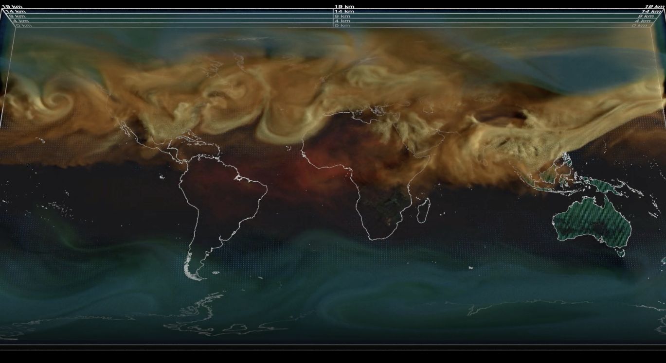
This new NASA animation shows the motion of atmospheric carbon dioxide emissions around the globe. In the startling video, we can witness greenhouse gases that are otherwise invisible to the naked eye.
These gases are destroying our environment, and scientists have constantly cautioned that our leaders and organizations are not doing enough to maintain the ecological balance on Earth.
What does the startling animation show?
Carbon dioxide (CO2) is the main greenhouse gas causing global climate change. Thankfully, the Earth’s land and oceans act as natural filters, absorbing about half of the CO2 emissions we produce every year.
NASA’s advanced computer modeling techniques help us figure out how much CO2 comes from various sources and where it ends up, giving us a clearer understanding of the bigger picture.
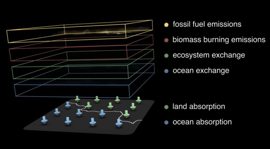
The new visualization shows carbon dioxide being added to the atmosphere throughout 2021. It is split into four major contributors — fossil fuels in orange, burning biomass in red, land ecosystems in green, and the ocean in blue.

The space agency claims that this model was designed to show exchanges between sources of carbon as well as carbon sinks (places where excess CO2 is absorbed).
At the same time, it shows how much CO2 is released into the atmosphere, especially in the Northern Hemisphere.
“Carbon dioxide (CO2) is the most prevalent greenhouse gas driving global climate change,” the NASA blog said. “However, its increase in the atmosphere would be even more rapid without land and ocean carbon sinks, which collectively absorb about half of human emissions every year.”
The animation shows Earth’s carbon sources as thick and smoggy orange-looking while burning biomass is visible in rusty red. Earth’s land-based carbon sinks may be seen in pulse green while ocean-based carbon sinks are visible in pulse blue.
You can watch the animation here.
The video makes it clear where most carbon emissions emanate – the United States, China, Saudi Arabia, and European countries.
Earth’s forest cover and other carbon sinks may be seen feeding off the carbon as they pulse green and blue until they don’t. Carbon sinks can swallow excess carbon only during the day.
What are your thoughts about this startling but much-needed animation? Let us know in the comments below.


